
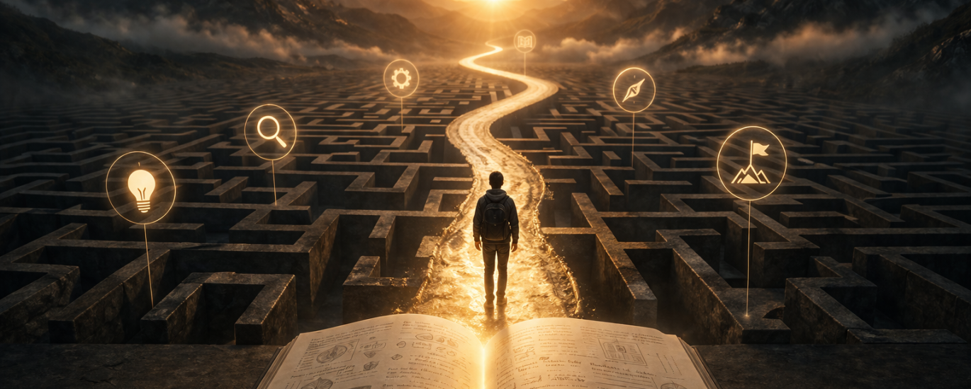
It genuinely feels like the internet collectively lost its mind over GPT Image 2.0.
Instagram posts suddenly look more cinematic.
LinkedIn graphics feel more polished.
Ads, thumbnails, mockups — everything feels a level higher.
And the funny part?
A lot of people using these visuals probably don’t even know why the quality suddenly jumped. They just notice that AI images now feel less “AI” and more like something made by an actual creative team.
But then comes the next problem:
“Cool… but how do people actually know which phrases to use?”
Soft cinematic lighting?
Editorial photography?
Negative space?
Shallow depth of field?
If that sounds like random creative wizard language — don’t worry.
We got you covered.
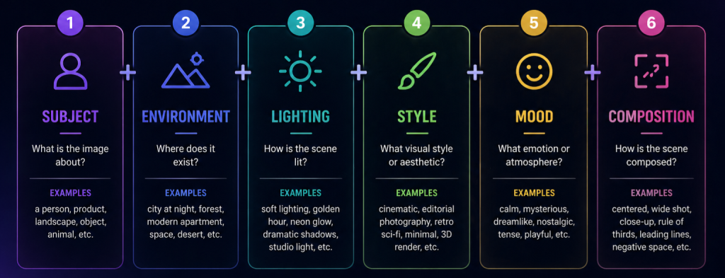
The Core Formula
A surprisingly effective structure is:
Subject + Environment + Lighting + Style + Mood + Composition
You don’t always need every part.
But this structure instantly makes prompts feel more intentional.
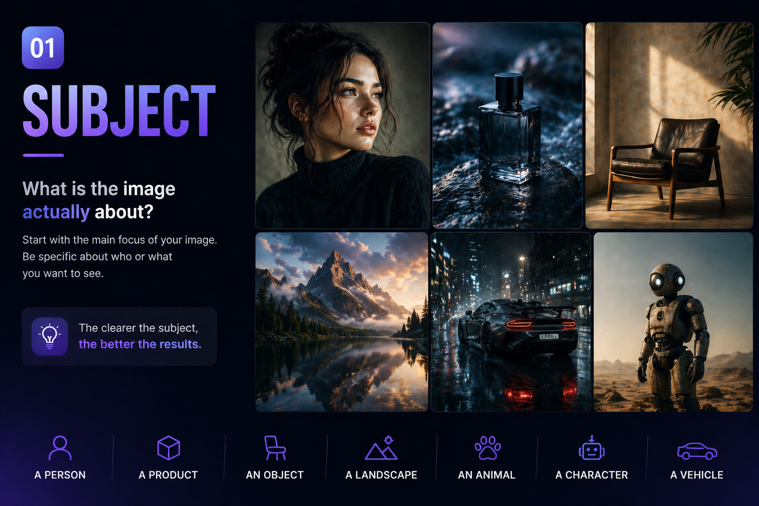
1. Subject
What is the image actually about?
Start simple.
Who or what is the main focus?
- a person
- a product
- a room
- a landscape
- an object
- an animal
Examples:
- “Minimal futuristic workspace”
- “Woman standing in neon rain”
- “Luxury perfume bottle”
- “Vintage robot in a desert”
The clearer the subject, the less random the result feels.
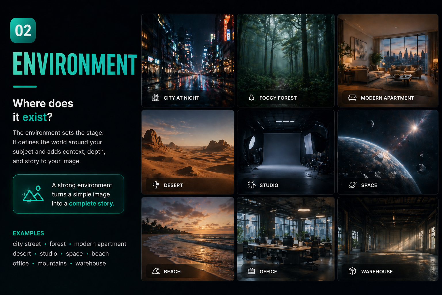
2. Environment
Where does it exist?
This is where the image gets context.
Examples:
- “dark apartment”
- “foggy forest”
- “Tokyo street at night”
- “modern luxury house”
- “abandoned warehouse”
- “floating in space”
Environment changes the entire visual story.
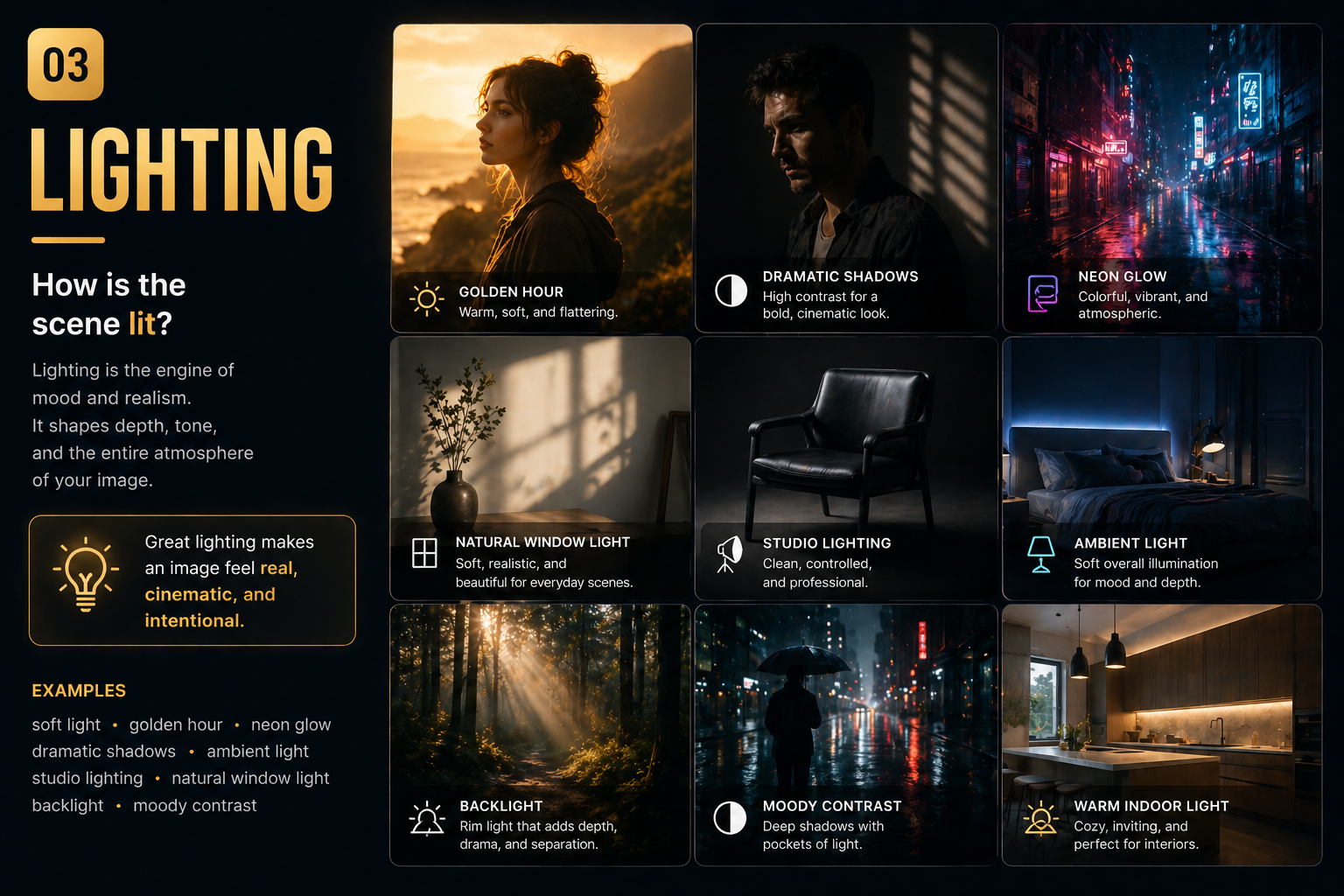
3. Lighting
Probably the most important part
Lighting massively changes image quality.
This is one of the biggest differences between:
- generic AI visuals
- and cinematic-looking images
Very useful phrases:
- soft cinematic lighting
- golden hour
- ambient blue light
- dramatic shadows
- natural window light
- studio lighting
- neon glow
- warm sunset tones
Honestly, lighting does half the work.
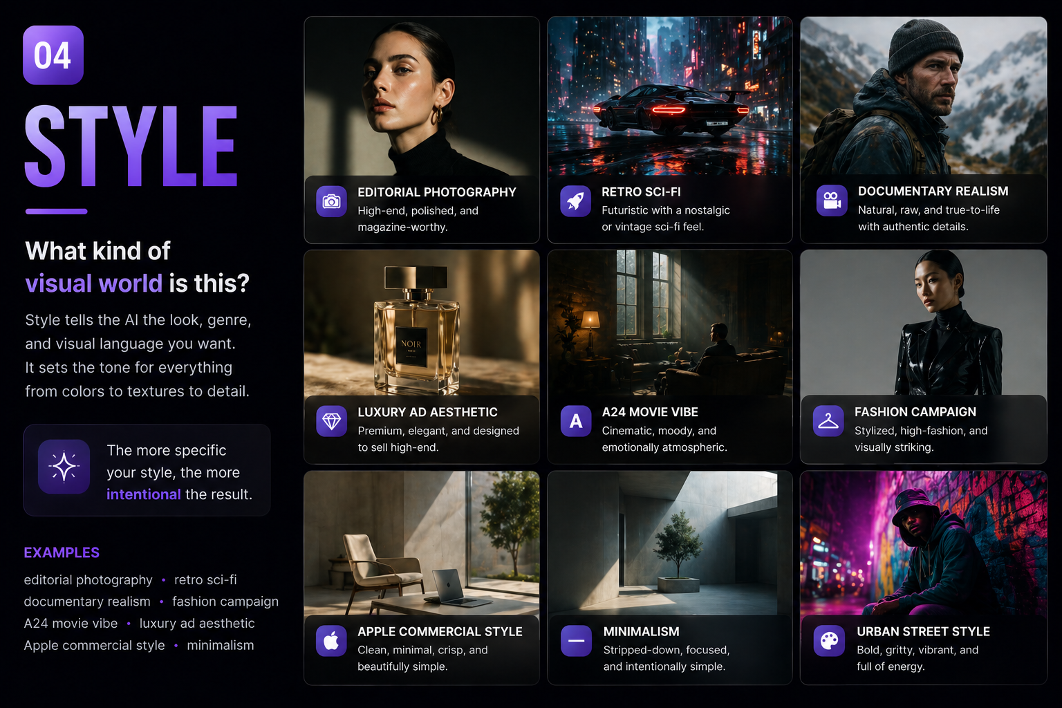
4. Style
Tell the AI what kind of visual world this is
Instead of saying:
“make it cool”
Describe the type of visual.
Examples:
- editorial photography
- luxury ad aesthetic
- documentary realism
- retro sci-fi
- A24 movie vibe
- fashion campaign
- Apple commercial style
- cinematic realism
This helps the AI understand taste and direction.
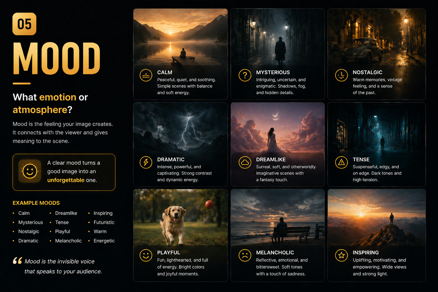
5. Mood
How should the image feel?
Tiny emotional cues completely change the vibe.
Examples:
- calm atmosphere
- dreamlike
- mysterious
- nostalgic
- tense cinematic mood
- playful energy
- futuristic but warm
Mood makes images feel less robotic.
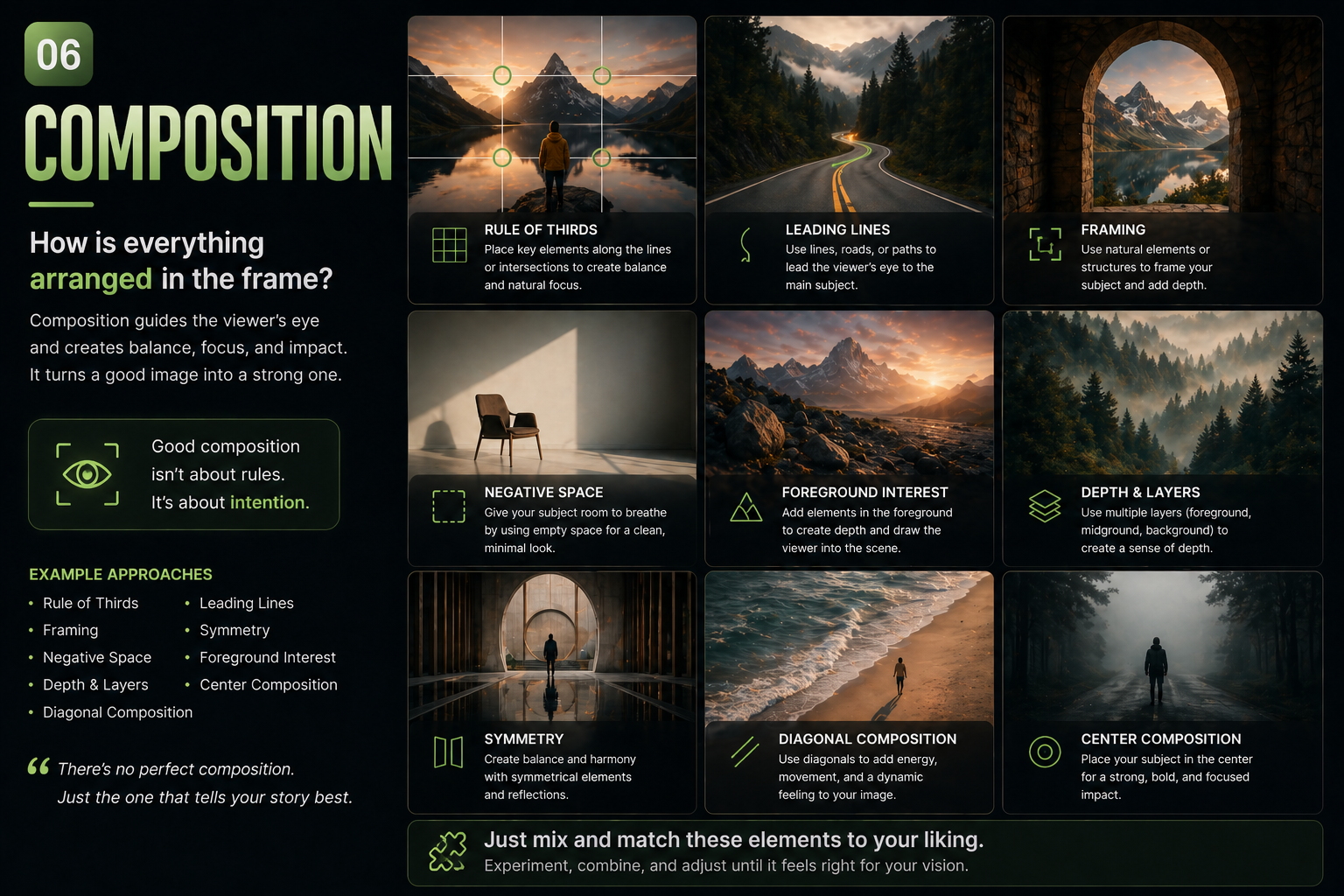
6. Composition
The thing most people forget
Composition controls:
- how clean the image feels
- how “professional” it looks
- how visually readable it is
Useful phrases:
- minimal composition
- clean background
- centered subject
- symmetrical framing
- negative space
- wide cinematic shot
- close-up portrait
- shallow depth of field
This is where images stop looking chaotic.
Small “Cheat Code” Phrases
These tiny additions improve results surprisingly often:
- no text
- realistic skin texture
- natural imperfections
- film grain
- subtle reflections
- photorealistic
- real-world lighting
- ultra clean
- high detail
Sometimes one small phrase changes everything.
Common Mistake: Overprompting
One of the biggest mistakes is trying to force everything into one image.
Too many:
- styles
- moods
- objects
- colors
- camera angles
…usually creates chaos.
Final Thought
The biggest shift with GPT Image 2.0 is this:
You’re no longer just typing prompts.
You’re acting like:
- a creative director
- a photographer
- a cinematographer
- or a designer
And honestly? That mindset shift is where the best results usually start.
Just mix and match the elements to fit the visual you have in mind — that’s where the magic usually starts.


