
We’ve all been there. You’re looking at your design—a Canva graphic, a slide, or a landing page—and you feel that nagging sensation:
“Something is off… but I don’t know what.”
Is it the font? Is the spacing too tight? Does it look “cheap” for some reason? Instead of wasting an hour moving elements back and forth by a few pixels, there is a 30-second fix you probably aren’t using yet.
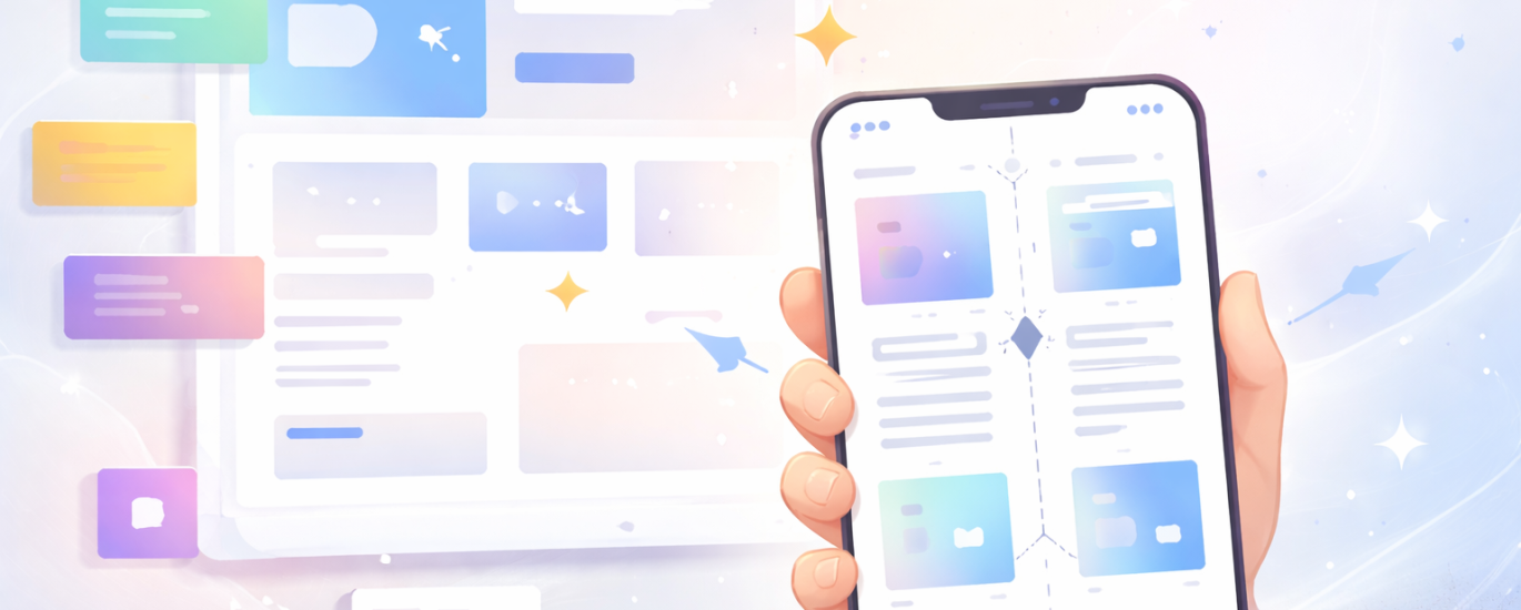
It’s called the Screenshot → Prompt Method.
The Concept: Let AI Be Your Creative Director
Stop trying to explain your design problems with words. AI models now have “eyes”—they can analyze layout, hierarchy, contrast, and typography just like a professional designer.
The method is dead simple: Stop guessing, take a screenshot, and ask for an audit.
How It Works in 3 Simple Steps
- Capture Your Work
Take a quick screenshot of whatever you are working on. This isn’t just for “designers”; it works for:
- Marketers: Landing pages and social ads.
- Founders: Pitch decks and app interfaces.
- Professionals: Complex Excel tables or internal reports.
- Upload to Your AI of Choice
Drop the image into ChatGPT, Claude, or Gemini.
- Give a Strategic Goal
Don’t just ask “Is this good?” Give the AI a lens to look through.
- “How can I make this look more high-end?”
- “What is distracting the user from the main Call to Action?”
- “Why does this layout feel cluttered?”
Real-World Examples
If you are making a… | Use this prompt… |
Presentation Slide | “How can I simplify this so the audience stays focused on my voice?” |
Sales Landing Page | “Identify 3 things that might reduce trust or conversion here.” |
Social Media Visual | “Suggest specific changes to fonts and colors to make this ‘pop’ in a fast feed.” |
The “2-Minute” Transformation
In a recent test, we took a standard Instagram visual that looked “fine” but lacked impact. We asked the AI for a brutal critique. It suggested:
- Cutting the copy from five lines down to three.
- Increasing the headline size by 30% for better hierarchy.
- Simplifying the palette by removing a secondary accent color.
The Result: We didn’t need a full redesign. We just needed four smart tweaks that took less than two minutes to implement.
Why This is a Game Changer
As AI becomes increasingly visual, the most important skill isn’t knowing how to use Photoshop—it’s knowing how to ask for the right feedback. You no longer need 10 years of design theory to create world-class visuals. You just need a screenshot and the right prompt.
Pro Tip: Use this “Master Prompt” for a deep audit:
“Review this design for layout, typography, and visual hierarchy. Provide exact edits on what to move, resize, or delete to achieve a premium, professional look.”
Bottom Line: Sometimes the best prompt isn’t a sentence. It’s a picture.