
AI diagram tools are having a moment.
Because diagrams are one of those tasks that always sound simple…
until you actually start making one.
You open a diagram tool. You drag shapes. You adjust spacing. You align arrows. You fix alignment again.
And suddenly 20 minutes disappear on something that should have taken five.
It’s the classic “hidden friction” that kills your focus.
That’s why tools like Eraser are interesting.
Instead of manually building diagrams, you describe the process — and AI creates the structure for you.
What Eraser does
Eraser focuses on text-to-diagram generation.
You describe a workflow or process, and the tool automatically creates:
- flowcharts
- system diagrams
- structured workflows
- technical diagrams
The goal is simple: remove manual diagram building and let you focus on the logic.
 Our Test
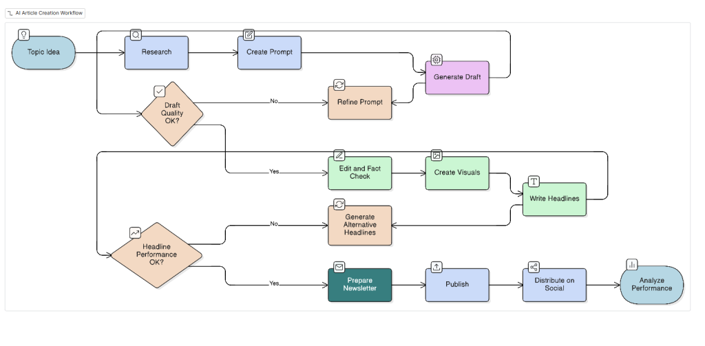
We tested Eraser using this detailed prompt:
Create a workflow diagram showing the process of creating an AI article for an online publication. Include these steps: Topic idea → research tools → create prompt → generate first draft → edit and refine → fact check → create visuals → write headline options → prepare newsletter version → publish → distribute on social media → analyze performance.
We added decision points:
- If draft quality is low → refine prompt → regenerate draft.
- If headline performance is weak → generate alternative headlines.
Result
The tool generated the structure quickly.
It correctly understood:  workflow logic sequence of steps decision branches
Which is the most important part of diagram tools. Structure is what usually takes the most time
The Visuals
The visual style is fairly minimal and basic, but still usable for:
- presentations
- internal documentation
- quick workflow explanations
We also liked that you can easily:
- change colors
- adjust font sizes
- tweak layout manually
So the AI creates the first version — and you refine. Which is often the ideal balance.
Where it works best
- explaining complex workflows
- planning new processes
- visualizing backend systems
- structuring messy ideas
It is especially useful when you know what you want to explain, but don’t want to spend time building shapes manually.
Where it feels limited
Design customization is not the main focus.
Compared to some “design-first” tools, the diagrams look clean and functional, but not highly stylized.
Which is perfectly fine for internal use, but less ideal for heavily branded visuals.
Our verdict
Eraser is not trying to be a full design platform.
It focuses on doing one thing efficiently: turning text into structured diagrams.
The output is visually simple but logically solid. Which often matters more.
Especially when the diagram is meant to explain something — not win a design award.
Eraser feels like a practical productivity tool rather than a flashy AI demo. It removes the most repetitive part of diagram creation and delivers a usable structure almost instantly. The visual style is quite basic, but the flexibility in editing keeps the tool usable. LMAI rating: 3.5/5